A logo is a cornerstone of effective brand building and marketing. A design based on serious user research, analyses, and design principles can provide a solid foundation for successful brand communication with both customers and employees. This is why a meticulous professional approach is essential.
Refreshing a Well-Known Brand
In the life cycle of most companies, there comes a moment when, after a few years in a competitive market, a previously effective and well-known brand identifier loses its freshness. It becomes outdated and no longer aligns with contemporary design trends. This is a sensitive moment for any brand, as there is a nostalgic attachment to the familiar logo, which has been invested with significant effort to ensure recognition by the target audience.
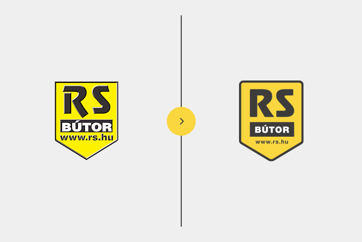
RS Furniture faced a similar situation, and our task in 2016 was to update the company’s logo while making minimal changes to the most recognizable elements that facilitate brand identification. This process is known as “facelifting.”
 Logo Update in Small Steps
Facelifting is not about making drastic changes but involves a series of subtle modifications that allow the old, somewhat outdated logo to retain its distinctive character while aligning with current graphic design trends.
- Facelifting Solutions:
- Modifying/Modernizing the Current Emblem Shape
- Changing the Previous Color Palette
- Using a New Typeface
- Modernizing Visual Elements
Let’s review these modifications in our case!
01 – Shield as a Graphic Element
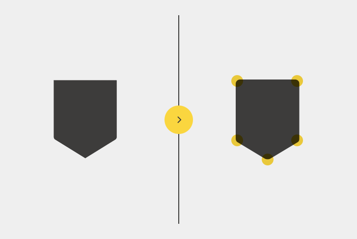
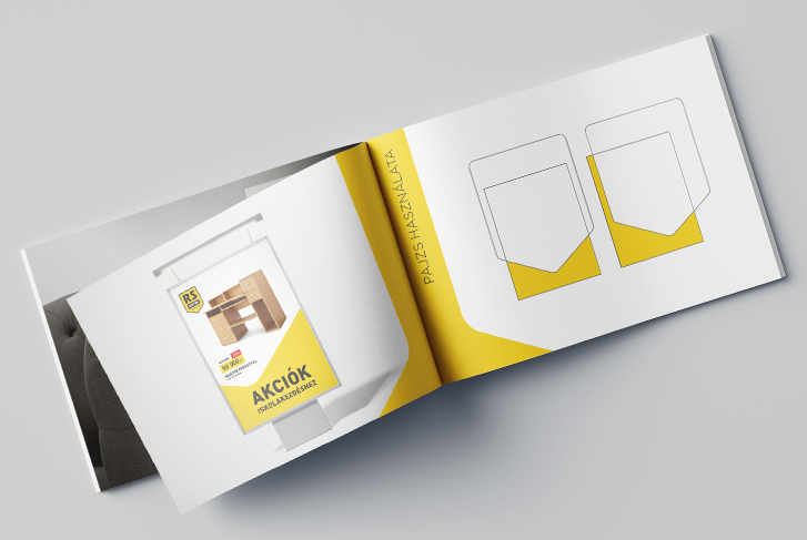
The most distinctive graphic element of the old logo was the shield silhouette. It formed the background of the logo, providing the “stage” for the other elements. Since this is the most critical and brand-identifying part of the logo, we modernized it with minimal changes. The shape was kept intact, with only the curves rounded and the shield’s outline adjusted. The rounding made the shape friendlier, while the thicker outline improved visibility. This shape became the central visual element in the entire rebranding process and appeared in every element of the new visual identity. A glimpse of this can be seen at the end of the post.
02 – Fonts
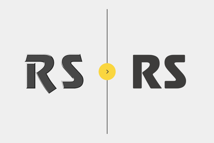
Another highly characteristic element of the logo was the “RS” typeface. We wanted to modernize rather than replace the typeface. We first removed the 3D effect from the letters, then made formal modifications. The “S” remained unchanged, as its modern line was still appropriate. However, the “R” required several modifications. We achieved the desired effect by removing the “breakthrough” in the top left corner and cutting off the lower extension of the right leg. The result was a more unified and modern typeface.
03 – Additional Graphic Elements of the Logo
After modifying the “RS” typeface, we turned to the word “BÚTOR” and its surrounding rectangle. The font used here was simple and did not need any changes. However, the frame around the text was very narrow, causing the text to be cramped, which affected readability and created a somewhat oppressive feel.
We reduced the text size to provide more space and improved readability. The position of the URL below remained unchanged but was slightly adjusted to align with the surrounding graphic elements.
04 – Color Changes
The RS logo did not require significant color changes. Instead of the bright lemon yellow, a more friendly “sun yellow” was introduced into the visual identity.
Result
By the end of the facelifting process, we achieved a refreshed logo that did not drastically change but met contemporary graphic expectations. The expansion of the “shield silhouette” introduced a new visual element into the identity, which is reflected in various ways across the brand’s graphic materials.
More posts

What Does a Web Designer Do?
Everything You Need to Know About the Web Design Profession A web designer is a creative professional who combines technological skills with design expertise. Their primary role is to design and[...]
 Logo Update in Small Steps