
Pharmaceutical products and brands by definition are meant to improve the lives and overall well-being of patients and people in general; yet, a strange anomaly persists amongst a great crowd of healthcare and pharma companies. Their online presence is so much in need of a UX health check, that it literally deteriorates the comfort and welfare of the users visiting their websites and social media profiles.
Read on for a few easy ideas about what pharmaceuticals can do to be a force of good whilst taking users on a journey that will truly feel like a relief.
We summarised the key takeaways from the article below. If you would like to learn more about these UX principles, just keep reading further.
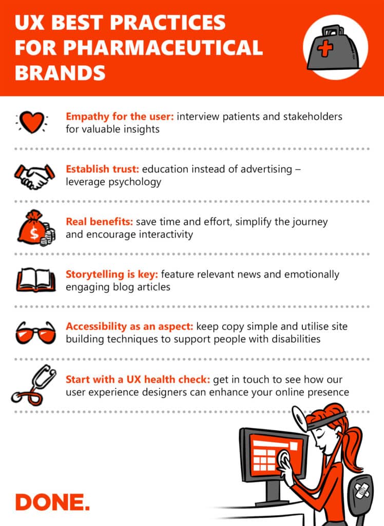
EMPATHY > INTUITION
The marketing strategy that the communication of healthcare products stem from is deeply rooted in a personal concern for patients and an understanding of their individual needs. Why should it be any different for websites? More often than not, pharmaceuticals (when it comes to their online presence at least) try intuitively guessing what their consumers expect instead of doing actual research.
Not so surprisingly, the principles that guide them to perfect their products, work just as well when building digital experiences. Interviewing users and stakeholders whilst they are using a website can prove essential to build the foundations for this empathy. To know what drives potential customers in their decisions and when they are going through the conversion funnel helps with delivering the information they need, exactly when and how they need it.
TRUST ISSUES
Let’s face it – healthcare is expensive, so we weigh our choices before settling for a brand. Even more so, a percentage of customers might not experience the benefits that they are promised through advertising. So, the main goal for any pharmaceutical brand is to manage expectations and deliver real benefits. This becomes considerably easier if trust can be established with the individual consumer.
As online presence is ever increasingly becoming the first point of contact, it is imperative to leverage the psychology of using real faces and certain colours alongside factual and real testimonies & social proof to build a bridge between brand and user.
These actual benefits can be anything from saving time and effort to complete an action on the website (search, registration, subscription, purchase), all the way to making vital information and data easier to consume through animations or infographics (interactivity versus ‘walls of text’).
The main point is, if pharmaceuticals are trying to advertise through their online presence instead of education, they are going to lose potential customers who are sceptical towards corporate communication. We all listen with ears peeled when a story is told through word of mouth, rather than self-proclaimed exaggerations.

ENGAGEMENT FOR ATTENTION
The struggle is real for any brand or website to fight for the attention of potential customers. As the competition is much fiercer in the world of pharmaceuticals, it is much more important to introduce interactive and dynamic elements to a website that promotes healthcare solutions. These actions can be rewarded by utilising custom animations and graphics, thus encouraging users to further explore through the content.
To retain the attention gained through engagement, pharma brands need to make sure that distractions are removed. Also, when text is broken up with videos or pictures, information is processed quicker visually.
TELL A STORY AND MAKE SURE IT IS HEARD
Even if these best practices are adhered to, it is possible that even the greatest story is going to be missed – especially if a site is not built to be compatible with people who might be living with certain disabilities. For example, screen readers make use of alt tags – these are all read out loud by these devices that aid browsing for visually impaired people.
Colourblind users find it easier to find links if there is a contrast or underlining at least for hyperlinked text. All videos should have subtitles and transcripts for people hard of hearing. Make call-to-actions stand out for conversion actions.
Most important of all – just like looking for the cause of an illness – making a pharmaceutical website more compatible for users starts with a UX health check by a professional. With the results of this exploratory research, brands can gain actionable insights to make their website work harder for the business.
Get in touch to see if we can find any weaknesses on your website.
Sources:
https://www.intechnic.com/blog/ux-of-healthcare-and-pharma-websites-best-practices
https://agentestudio.com/blog/healthcare-website-design-best-practices
https://www.cmdsonline.com/blog/the-looking-glass/pharma-brands/
More posts

THE DONE. STORY
Alongside topics like soccer, viruses, and energy energypolitics, the characteristics and principles that make websites successful are something everyone thinks they understand, but few truly have reliable knowledge about. We[...]