“The best error message is the one that never shows up“
Thomas Fuchs
We totally agree. However, it is indisputable that user interactions will eventually lead to errors. Even though when designing an interface our intention is to create a barrier-free, smooth user flow, errors still happen.
Error messages seem like an easy solution to use in this case, but we have to be careful how and when to use them, especially in which format. Error messages are an elemental part of the user experience.
The worst error message is the one that doesn’t exist. Stopping the user flow without any explanation can frustrate users and may lead to leaving the site.
Good error messages, on the other hand, can increase the speed of user flow. Showing error messages at the right time with the right text format can help users get back on track.
WHEN DO WE TALK ABOUT ERRORS?
Errors can come from 2 sides: the system or the user. We call it an error when the user is stuck in the flow.
- The system fails to complete an expected action.
- The system doesn’t understand the user’s input.
- The user is not aware of the process.
“Established wisdom holds that good error messages are polite, precise, and constructive. The Web brings a few new guidelines: Make error messages clearly visible, reduce the work required to fix the problem, and educate users along the way.“
Jakob Nielsen
WHAT IS THE RIGHT FORMAT OF ERROR MESSAGES?
Error messages can be granted by using modal dialog boxes, in-place messages, notifications, or balloons.
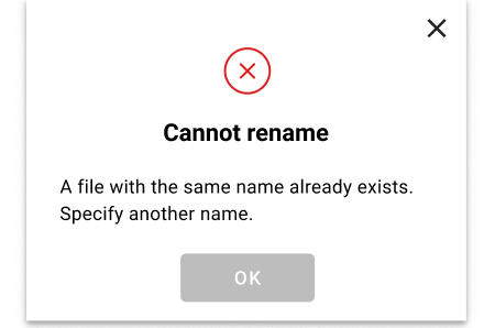
Use modal dialog boxes when you want to prevent users from interacting with the underlying content. This is the perfect solution when the user flow must be interrupted.The great benefit of modal boxes is that it certainly grabs the attention of the user. But think first and ask yourself the question: Is it necessary to interrupt the user flow? If yes, then use the modal.

Source: thisisdone.com Example of modal
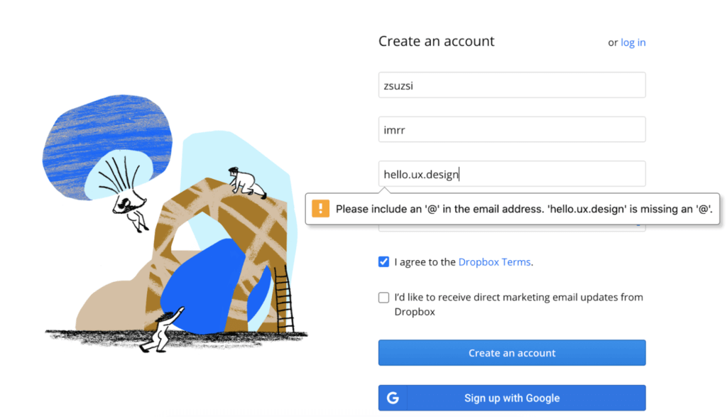
In-place messages are used when an input field is not filled with proper values or left empty. In these cases show them the error immediately next to the field after leaving it. This will make users aware that they have to correct it before moving on. In-place messages’ alternatives are the balloons.

Source: thisisdone.com Example of in-place messages

Source: dropbox.com Example of balloon message
Notifications are mostly used when an interaction is not successful. It is placed in a visible part of the screen. Examine if action is required from the user and if we want to stop them in the flow. Based on the situation you can use different types of notifications.

Source: thisisdone.com Example of notifications
WHAT IS AN EFFECTIVE ERROR MESSAGE AND HOW TO CREATE ONE?
An efficient error message not only notifies users about the problem and how it occured, but it also shows the next step for the users in order to solve it
Here are some basic rules to follow when creating error messages:
- Always communicate what is happening.
- The message should always get to the point. Avoid writing novels.
- Always show the way to fix the problem.
- Show the message at the right time and right place.
- Use red colour for error messages or input fields with errors, but do not lean on only colouring.
- Use the right tone and don’t forget that copy is part of your design.

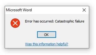
Source: answers.microsoft.com This is a bad example for an error message
During the design process it’s recommended that you count with the usual error cases:
- 404 – Not found
- 401 – Unauthorized
- 500 – Internal server error
On these pages it is important to draw the user’s attention to what is going on, how they can navigate to existing pages of the site. These pages can be spiced up with humour. Here you can find 404 pages done by our creative team at This is done.
- http://ivsz.hu/404
- https://pestextfestival.hu/404
- https://cordiahomes.com/404
- https://wagnersolar.hu/404
- https://makersredbox.com/404
- https://exactsolutions.hu/404
- https://drsk.hu/404
- https://www.linguarum.de/404
- https://awenrg.com/404
- https://www.asetek.com/404
- https://www.bombi.hu/404
- https://helloparks.com/404
- https://digitalismegoldasok.hu/404
- https://roadmovie.hu/404
ERROR PREVENTION
Even if we discussed how to create effective error messages, our aim with usability is to avoid them. Error prevention is one of the 10 usability heuristics proposed by Jakob Nielsen. Many errors can be avoided through empathic design.
Some Examples:
- When you expect password requirements at registration, set the requirements. Give users real-time feedback on whether the password they entered meets the restrictions.
- In a date picker the dates that already passed can be disabled
- The primary button on a page can be disabled until all the mandatory fields are filled
- Use hint text in input fields, so user know what kind of characters can be placed in what format
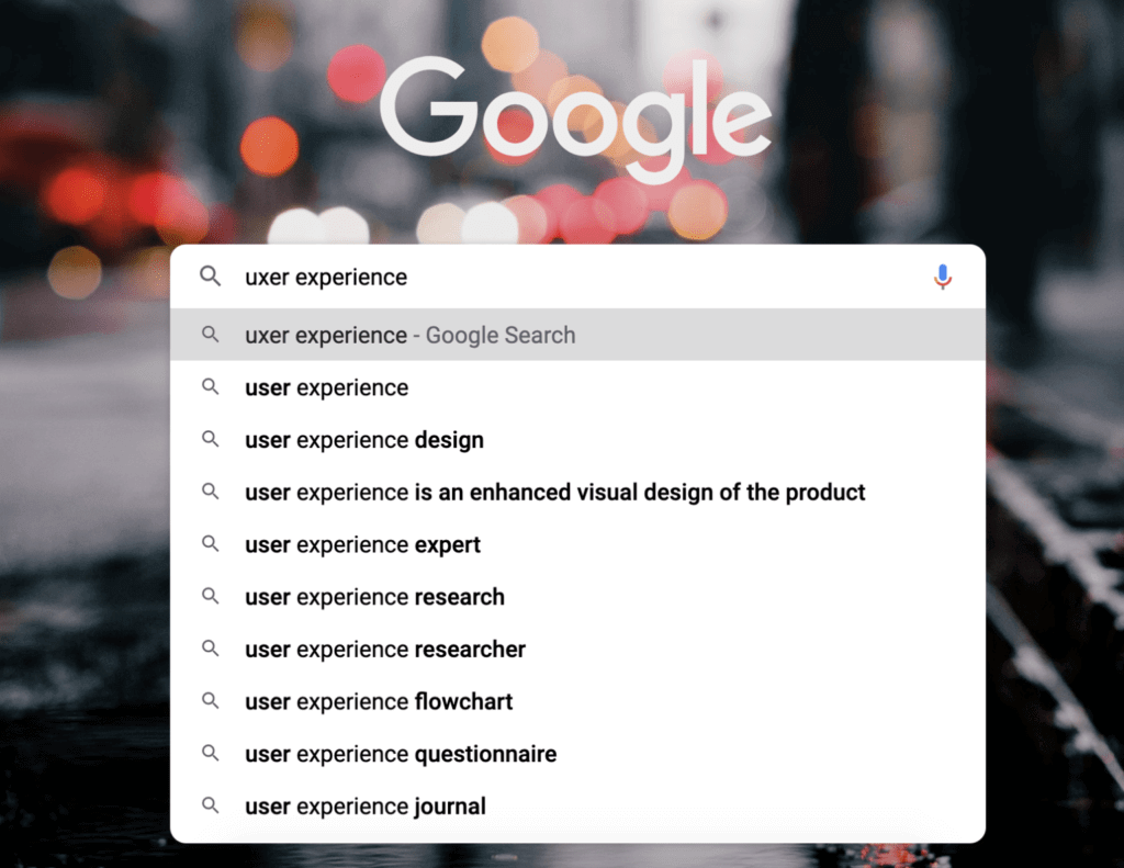
- One of the best examples of error prevention is Google AutoComplete. Misspellings are common, and immediate corrections in the recommender will help you avoid them a lot.

Source: google.com Example for error prevention
CHECKLIST TO USE WHEN DESIGNING ERROR MESSAGES
1. Be polite. Use a tone with the user that doesn’t frighten them.
2. Be meaningful. Only include the necessary information.
3. Place it properly. Choose the right format of the error message at the right place so it’s visible and relevant.
4. Do not blame the user. Never say that the error is the user’s fault
5. Use human language. Don’t use error codes or abbreviations
6. Write briefly but precisely! Give short and constructive advice of how to eliminate the error
7. Make it visible. Use red colours for messages, but also use simultanly other cues so users with disability can see the message as well
8. Don’t use only upper case letters. It’s hard to read.
9. Give directions. Give users a solution to correct the error if possible

